Monday, 30 September 2013

Camera Shots - Angles

 
High angle shot - This shot can be used for various reasons. It can be used to show somebodies perspective. It may also be to show how over powering the other character is compared to the character on screen.


Low angle shot - This shot may also be to show somebodies perspective. It also helps show the audience the contrast of size of the person and the building/object. The example above gives us the impression that the building is much taller and overpowering than the person looking at it.


Level/Neutral - This shot has no real purpose, other than to give the viewer a clear shot of what is going on.
 
 
Tilted - This shot is used to confuse the audience, as we are used to looking straight at something, and not at something at an angle. The example above gives us the impression that the view we are seeing, is from something that has just been dumped on the side.


Romanticization; Barthe's Theory


Ways in which this representation of young women has been romanticised/mythologised
  • Glowing pink typography
  • Most items pink, such as nail varnish, skirt , walls, card etc.
  • Small dog
  • Make-up
  • Immediately focuses on hair and beauty
  • Happy and uplifting song "Perfect Day"
  • Big group of shirtless guys
  • Cheerleading
  • Mainly girls in the scene
  • First part of dialogue is about shopping

Camera shots - Frames

All films contain different types of camera shots. Below, I will discuss the seven most used frames and the reasons they are used.

The frame for this shot is ECU extreme close up, this is to focus the viewers attention on one particular thing, that usually plays an important part in the film. Or even the actors face, to catch their facial expressions. Here we see a wedding invitation, this immediately shows us that the film is about a  wedding, before we hear any dialogue.


The frame for this shot is ELS extreme long shot. This is usually at the beginning of a scene to help the viewer understand the surroundings, and where the following scene is based. Here we see that the first scene is based in New York.


The frame for this shot is over the shoulder. This is usually used when two characters are having a conversation, swapping back and fourth on various characters.


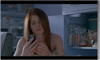
 The frame for this shot is CU close up, as it focuses on the actors face to help show the audience their facial expressions and emotions.
 
 MLS medium long shot is cut off just below the knee. This shot usually focuses on various characters. It also captures the surroundings and things going on around the two main characters.
 
 
MS medium shot is one of the most common frames. It can capture various of characters; usually in a conversation, and is close enough for the audience to see the characters facial expressions.
 
LS long shot is used to show various characters as well as the surroundings. It's also used to show the characters body language.

The Hobbit V. Paranormal Activity


Wednesday, 18 September 2013

Groups that are effected by Dyers Theory

Teenagers - when poeple think teenagers, they automatically think; moody, troublesome, and lazy. This is because of the media mainly presents teenagers this way, although, very few are like that.

Black People - if a story about a black person being murdered or beaten up, people automatically think it was gang related. Due to the media, people think that black teenagers are trouble.

Muslims - because Bin Laden was all over the news, when people think Muslims, they think terrorists. When actually, very few are.

Mission Impossible opening scene.


Enigma code:
Is she dead?
What is the rabbits foot?
What is the connection between Tom Cruise's character and the women?
Why do they think that he has it?
What happened on the plane?
Why do they want the rabbits foot?
How did they end up there?

Action code:
A women being kept hostage
Shooting
Threatening
The gun
A man with tape over his nose
Tom Cruises character tied to a chair

Symbolic/semiotic code:
Dark and gloomy colours, making it seem mysterious about the location.
Fidgeting in chair, shows anger and panic.
Dirty, and beaten up faces; to show that there was a lot of action before this scene.

preferred and opposite reading.

This is a film poster advertising the film 'Taken 2'. The storyline of the film is about a father trying to rescue his kidnapped daughter. However, for people that haven't seen this film may get the wrong interpretation.
The preferred reading of this poster is to show the father on roof tops, looking for his daughter. The smoke and sparks are to show that there is a lot of action in the film.
Although, the opposite reading of this poster is that it looks like a film based on war with the smoke and sparks. Giving the viewer the wrong idea on the film.


Pitch Presentation.


Here is mine and doms film pitch 'UCL nightmare'

Feedback from class
- Killing off main characters wasnt a good idea.
- Good casting
- Very similar to the TV program 'misfits'
- Good title, doesnt really give much away

Sunday, 15 September 2013

The Hangover poster analysis


In this poster we see three men all looking rather worn out, this gives us the impression that these men have been on some sort of adventure. The guy at the front seems to have a black eye, the guy on the left also has blood on his shirt, and the man on the right is holding a wet cloth to the side of his cheek to ease the pain. This tells us that their adventure includes violence. The two men at the backs facial expressions show confusion, this tells us that during the film the three of them might face some sort of mystery solving, or dilemmas to deal with. The baby at the front wearing sunglasses, isn't something you see everyday, its quite peculiar, this shows us that their adventure contains lots of random events. Its also quite an immature thing to do, this gives us an idea of what sort of characters they are.
The title of The Hangover is set out as lights from Las Vegas, this helps tell us where the film is set.

Thursday, 12 September 2013

Image Analysis


In class, we were given a genre and a target audience, our group got given romantic comedy, and the audience was for teenage girls. We decided that with this age group we would create a scene from a typical romantic comedy. The image shows a happy couple, and a very jealous girl. We placed the girl that is in the relationship, in the middle of the picture. This helps show that she is the main character, and she is likely to be the first person you look at. We then placed her boyfriend slightly to the left, so he would be the second person you look at. This immediately shows the audience that this is about romance, as they are holding hands and gazing happily at each other. We positioned the rival over to the right with her back slightly turned, pulling a rather unhappy face. This is to show the audience that it isn't all about the happy couple, and there is some rivalry between the two girls.  This might make the audience think that the couple may not last, with the help of an interference.
I feel that our image has worked well, as it clearly shows the genre. However, we could have improved this image by making the couple stand closer, this would immediately show the viewers that they were a couple.

Tuesday, 10 September 2013

The Dark Knight opening scene analysis.


This is the opening scene of The Dark Knight. The scene immediately introduces a new villain to the Batman sequel. In this scene a bank robbery takes place. The opening shot is filmed from above the buildings zooming into one particular building. From the surroundings, it gives us the impression that its just an ordinary day, but the music is telling us otherwise. The contrast of the two, creates a slight suspense, making the viewer expect that something is about to happen. The pulse of the music is likened to a ticking time bomb about to detonate causing destruction and mayhem. The scene is filmed in broad day light, this gives us the impression that the new villain known as 'The Joker' is fearless, and has no worries about being caught.
 We hear the unknown faces mentioning that they know why they call him the joker, but they don't actually tell us why. They also mention that the jokers as crazy as they say. Making us realise he's a well known villain. This gives us an idea that he is rather sinister, which makes the viewer intrigued to meet him.
The theme of this scene is destruction, because they have total disregard for human life.
The gang of criminals wear masks, not only to cover their identity but also to intimidate the staff working at the bank, and to give the appearance that they are disturbing.