Tuesday, 21 January 2014

Question 7

This is an example of James' title for his prelim task. His film had the genre of action which is similar to ours now, but you can see the font is very absurd for a film. Also, the font is not completely central. The title is also on a black background, which is boring and not imaginative.


Divided's title was completely central, along with a plain colouring, which fitted with the rest of our titles. It floated onto the screen, like it was in the waves instead of being steady, with a transition going out as well.


This is another clip from James prelim, focusing on the camerawork. This film used some zoom to focus on the penguin. Zoom looks unprofessional and is avoided.


In our film, we avoided using zoom. Instead we had a still camera with the actor moving closer to the camera. This looks more professional than using a zoom. It also creates some tension by being far away, as if it is mysterious.
This is a shot from Sarah and I's prelim task called Timeout. In this shot we have a very similar panning shot, moving along the wall before it opens up to the classroom. It's all done by freehand which makes the camera shaky as it moves.
In our real production, the pneulitmate shot is a pan around the woodlands. For this shot, we had a tripod set up with the camera on top. This created a steady shot which stayed level throughout. The shot was like it was from Christopher's point of view.


Also, the music we used in both prelim tasks weren't transitioned as well as in our final task. The final task had music fading in and out, and it built the tension well, working in tangent with the pace of the scene. In my prelim, we used real songs as a voiceover for the protagonists. However, they were not dubbed very well nor did they have transitions in or out. This doesn't create a very professional production.

Question 6


Questions 4 and 5

Due to technical difficulties, please follow the link provided below:

Question 3


Question 2


Question 1


These are 9 screenshots of our opening which we can find all the conventions of the an opening.

  1. The first shot is the titles, which is similar to other thriller titles such as 'The Sixth Sense'. The font is different from the rest of the titles so the audience can clearly distinguish the difference. This is an uncommon theme in films because the font is normally the same, however as the film is very 'different' it would seem appropiate to do this. The positioning of the title was so it wasn't missed and the colour made it stand out from the background image. We put a powerful image of a dead girl underneath the title to contrast the white font, which usually represents peace and innocence.
  2. This shot is the first shot of the film, which sets the scene immediately for this particular scene. The woodland is very typical of a thriller/horror, due to eerie nature and apparent darkness. The camera pans around to show how alone Christopher will be when we eventually cut to him. An empty shot is usually the case in most films to set the scene, so the film can develop accordingly.
  3. Costumes and props were important to sticking the genre of thriller and horror. The costumes was really that of just a regular teenage boy, which we tried really hard to portray. The colours contrast the setting and the weather in the scene, with the bright blue jacket and jeans with green boots standing out against the brown woodland and grey weather. Portraying the main protagonist as an innocent boy was key in the first scene as he develops throughout the film to show he's not that ordinary. This keeps the audience interesting to see how the film develops.
  4. The camerawork had a variety of shots including show panning shots and quick flashes. The shot you can see (middle left) is the pneultimate shot which is a panning shot of the woodland where Christopher is situated in his dream. This is one of many scenery shots but we also included quick flashes of other scenery and shots to mix in, creating diversity.
  5. The titles had the same font throughout, which was just a generic font, with serif. This font looked professional and was in the colour white to represent innocence, as previously noted. A good, clear font was key to see all the main people involved with the film. All actors were named individually, which we saw as a key convention to our film. Jennifer Aniston is a star who always has to have her name on screen by itself, and we incorporated this into our film.
  6. The opening scene of Divided will probably leave the viewer confused after seeing it, as it is very unclear what is happening. But this ultimately tells you what is going to occur in the rest of the film. The sense of confusion was something which we were desperate to get across as it is key in most thriller/horror films. It sets the film up nicely because we see the main protagonist and a dead body, which link together throughout the film.
  7. Thriller and action were our main genres, which we portrayed clearly. The dark colours of woodland and the weather complimented eachother nicely, alongside the bright colours of Christopher's clothes. Tension is built slowly which is typical in a thriller before the end of a scene, before we then see Christopher wake up, which ends this tension.
  8. We first see Christopher walking through a forest alone, instantly telling the audience he is different because he is unaccompanied. The overvoice of a doctor also introduces the character more, because that's the only voice we hear, suggesting Christopher is quiet. The audience then gathers the overvoice is talking about him. Although all of this, we kept the characters background very limited, like not naming where he lives or who he could live with etc.
  9. In our production, we only used one special effect which was the flash from the 'Global Film Productions' logo into the start of the film. We kept special effects to a minimal because this would take away the realness of the situation and could potentially lose some seriousness. It isn't very typical of thrillers to use special effects, prehaps only non-diegetic sounds.

Wednesday, 18 December 2013

Please complete our survey!

Watch the film opening here: http://www.youtube.com/watch?v=ySBdEtLOqd4

And then click one of the following links to participate in our survey powered by Survey Monkey:

Click here to take survey

https://www.surveymonkey.com/s/JX2CD7C

THANKS GUYS!
 

Tuesday, 17 December 2013

Locations

For our sequence, we had to choose relevant locations to shoot in order to get the best shots. Our film was a thriller and therefore we needed somewhere mysterious and gloomy, so we decided to film it in a wooded area. We also had shots at two seperate houses and a school field.


We filmed the woodland area at Galleywood Common which is roughly two miles from our school, so it was pratical for all the group to travel to. Dom visited this area before we started filming and took this image, to show the rest of the group and to see if it was pratical.
The image above is taken of the exact location of where Chris first walks through the woods right at the start of the sequence. It was an overcast and cold day, which added a eerie atmosphere.


This is the route we had to take to Galleywood Common


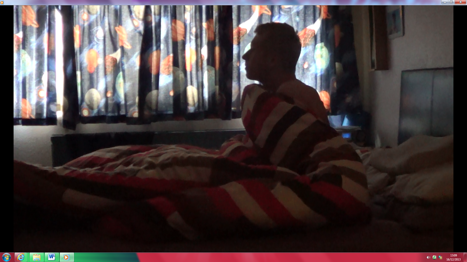
This is james' room where we filmed he last shot of Chris waking up. We chose this location as it was easy for all of us to get to, and it was a typical boys room. The window on the far side (left side in the film) gave suitable lighting along wih the lamp just below the window.
 

Opening Titles Timeline

T1) 0:00- 0:17 Summit Entertainment


T2) 0:18-0:21Global Studio Productions


T3) 0:22-0:26 James Clifford


T4) 0:27-0:32 Sarah Maerz


T5) 0:33-0:38 Hariet Carter

T6) 0:39-0:42 Dominic Punt


T7)0:43-0:47 Megan Laner-Hoskins

T8) 0:48-0:52 Divided


T9) 0:53-0:57 Screenplay from Benjamin Tin


T10) 0:58-1:00 Casting Gina Brookes


T11) 1:05-1:07 Music by Ben Clarkson


T12) 1:08-1:11 Costume desiner Emma Ley

T13) 1:12-1:15 Editor Patrick Greene


T14) 1:16:1:20 Produced by Stepen Leadwater


T15) 1:42-1:48 Directed by Bill Mertz


Divided Questionnaire


 This is the questionnaire that we will be giving out to the audience while watching Divided.

Monday, 16 December 2013

Divided Opening Sequence


Poster


This is our poster to advertise our film 'Divided'.

Sunday, 15 December 2013

Peer Evaluation


In class, we evaluated everyone's rough cuts for their opening scene.
From the feedback that we got, we realised there was a few things that we needed to change.
Such as:
·         Looks too much like a trailer.
      ·         change the voiceover to an adults voice.
      ·         Take out the interview.
       ·         Too fast at points.
      ·         Lighting in the bedroom is too dark.
      ·         More shots of the girl in the lake.

How were these fixed?


·         We took out the clips of the alta egos to make the sequence look more like an opening scene, by just focusing more on the main character.
·         The voiceover has been redone using an adults voice.
·         Interview was removed and replaced with scenery shots instead.
·         We ignored the comment on it being too fast, because we believed the pace was acceptable with the confused nature of the scene.
·         We re-filmed the bedroom shot with more lighting, in exactly the same concept.
·         We added a few extra snippets of the body in the lake shot towards the end of the scene.

Font Analysis

For the title 'Divided' we thought of the idea of the title appearing in sections leading into the middle were it would join saying 'DIVIDED' as each piece of the title could represent each alta that all join as one person.


Divided rough cut


Character introduction


Music research

To help make the genre thriller clear, we have to make sure that the music we use creates a suspense or an eerie feel. After typing into youtube 'Eerie music' and 'Music with suspense' we even researched music that was used in the TV program homeland. We came across these four that we felt would fit into our opening scene perfectly.


Once each shot is lined up correctly, we will then decide which one has the most effect.

Wednesday, 11 December 2013

Producion Diary

Running Commentary
Lesson 1: In our first lesson together, we decided our film, which was Sarah’s pitch. James and I then added our own input into the idea, and we updated Sarah’s prezi accordingly. We assigned our roles too; we tried to make them to our own personal strengths.

Lesson 2: Watched other peoples film pitch and then pitched our own. Took feedback from the other groups and noted it down.
Lesson 3: Started work on the storyboard and finding relevant places to shoot.

Lesson 4: James and Sarah continued work on the storyboard, thinking of more shots to film. Dom started on the music selection.

Lesson 5: Continued work on storyboard.

Lesson 6: With Sarah absent, James and Dom began piecing together the storyboard, trying to put it in order.

Lesson 7: With the storyboard completed, we took pictures of the storyboard and decided how to present it.

Lesson 8: We decided that I would talk about the storyboard on a green screen and put it over the top of the pictures. We filmed it in the classroom and uploaded it onto Adobe Premiere.

Lesson 9: Sarah worked on Adobe Premiere putting the speech over the pictures of the storyboard. James and Dom worked on the shooting schedule.

Lesson 10: Sarah finished off editing on Adobe Premiere and ended up finishing the storyboard, whilst James and Dom finished off the shooting schedule and also completed the Risk Assessment.

Lesson 11: We all went to Galleywood to James’ house, Sarah’s house and Galleywood Common to film the opening scene of.

Lesson 12: This was the lesson where we all uploaded all our video clips to Adobe Premiere and Dom started to piece it all together whilst James and Sarah worked on the green screen, to add another piece into the opening scene.

Lesson 13: Dom and Sarah carried on editing whilst James updated the production diary and looked at title font styles

Lesson 14: Dom carried on editing and then we all went around the school looking for the best venue for taking the picture for the poser.

Lesson 15: We had a group discussion and found out that the Title ‘Troubled Diversity’ was too complicated so after debating , we came up with ‘Divided’.

Lesson 16: With Dom (the main editor) absent James updated the production diary, whilst Sarah started to work on the Title ‘Divided’. Then we both started to work on the poster.

Lesson 17: We decided as a group that the idea of mental illness wasn't clear enough so we added a voice over of a doctor diagnosing Chris with Schizophrenia.

Lesson 18: James and Sarah filmed shots of Dom and an extra; Alex. As we thought that this would introduce more altas. Dom then went away to look for some music when James filmed shots of Sarah and Alex.

Lesson 19: All the class watched all the other classes productions and marked them all, gave peer evaluation.

Lesson 20: We got our evaluations and feedback back from the other classes and with Sarah absent James and Dom went through them and decided what to change and keep.

Lesson 21: We decided to remove the clips of the other altas as we felt that introducing so many characters in very little time, got a bit confusing. We now decided that for our opening scene we would only introduce Christopher and the dead body in the lake.

Lake shot

To achieve the shot of a girl dead in a lake, we filled a bath with leaves and water. Megan layed in the water as we postioned the leaves to cover any evidence of being in a bath. We used an extreme close up so you could just see the water, leaves and her face.
We used pale make up to show the fact that she is dead, and may have been there for quite some time.

Images of the group working

Here is Dom playing around with the typography for 'Divided', exploring which one fits the genre the most. 
 
Here I am on Photoshop working on the poster to advertise 'Divided'.